Role
User Research
Product Strategy
UI Design
Interaction Design
Usability Testing
Tools
Figjam
Notion
Dovetail
Figma
Otter
Timeline
4 weeks
(Jul - Aug '22)
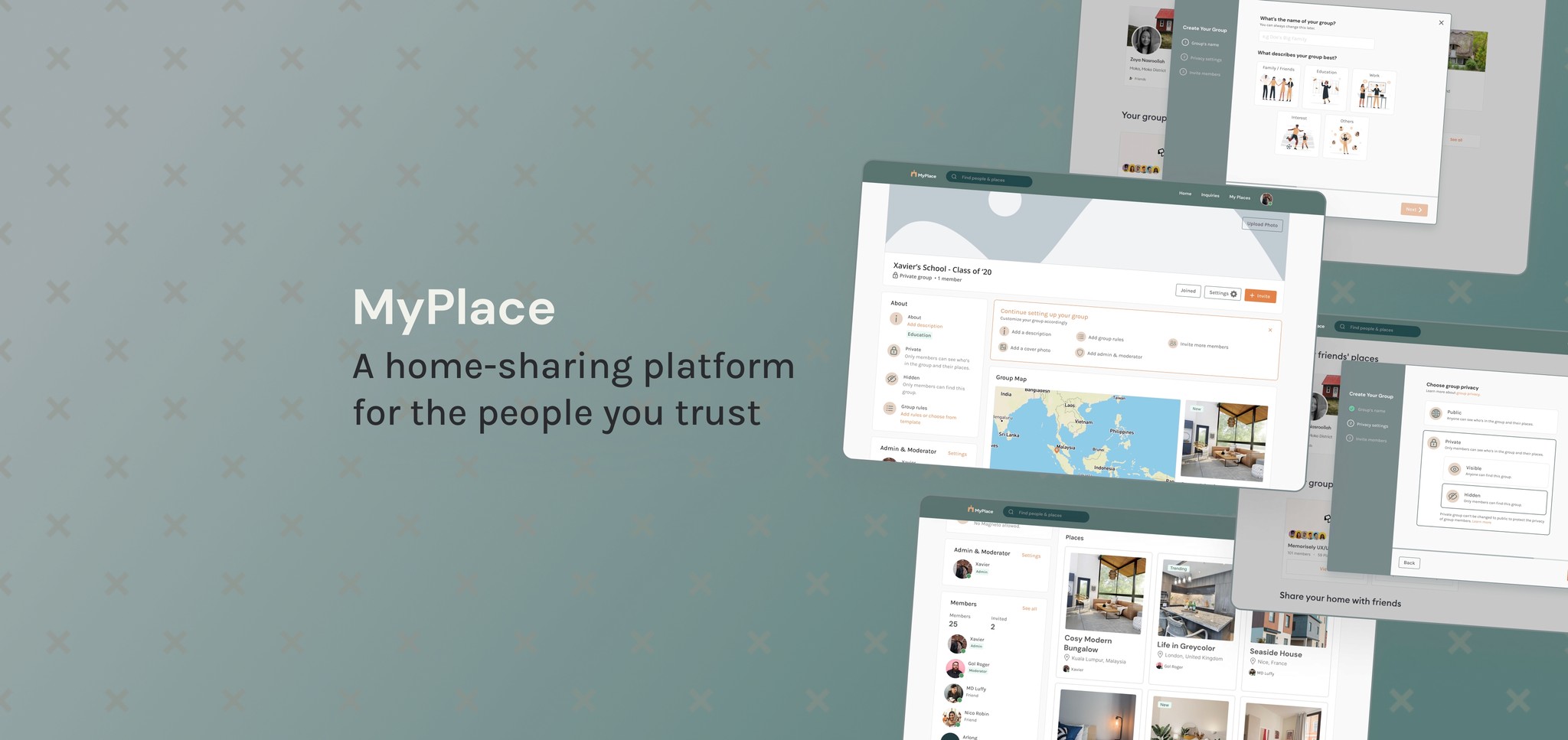
MyPlace has organically grown a community of thousands of users in their closed Beta for the past year and a half. Currently, group creation can only be done manually by the MyPlace team, which means no users can create their own groups.
With the increasing number of users, there are more reasons for the users to have control of group creation. Thus, this feature needs to be built in the best way to fulfil user and business needs.
The Solution
From the user research and competitive benchmarking that were done, it was found that users want to be assured that the group is a safe platform to share their homes, and the whole process needs to be easy.
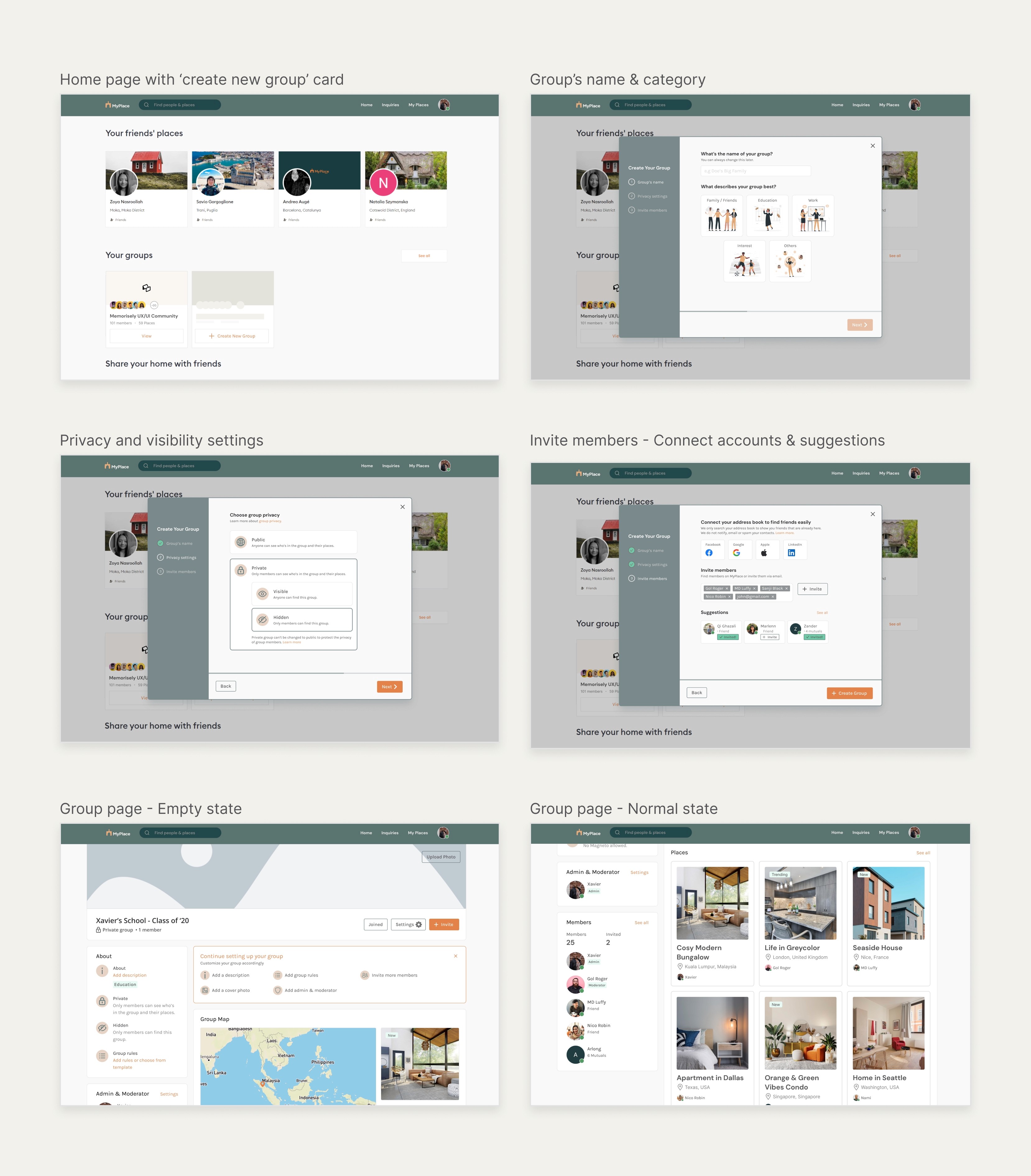
Thus, we designed the group creation process with a few necessary steps only, all other optional details were moved post-group creation. We also emphasized safety by including group privacy and visibility settings in the process.

Usability Review
First, to help us better understand the current product, we conducted a usability review to identify pain points and wow moments in the existing experience. We covered a few flows such as signing up, listing a place and adding group members.
We found that the overall experience of navigating the website was quite smooth and easy. Very few frictions considering that it was still in closed Beta. The copywriting was also great, with a welcoming/friendly tone and clear instructions.

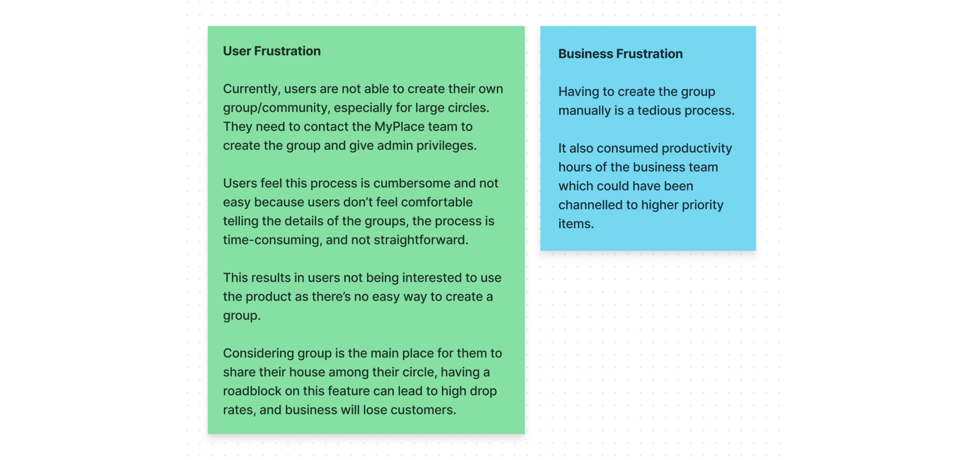
User & Business Frustrations
Following a usability review, we defined the business and user frustrations revolving around the absence of a group creation feature.
The current process of creating a group by contacting MyPlace team manually can frustrate the users. This causes them to abandon the website and business will end up losing customers and profitability.
Competitor Benchmarking
We moved on to competitor benchmarking to help us identify standards in competitor products that could be used to improve the existing experience.
For direct competitor of house hosting, my colleague referred to Airbnb. For indirect competitors, I used Facebook and Reddit, specifically benchmarking the group creation process.
Some of the notable features were
Breaking down the flow into a few digestible steps, one at a time.
Made the group creation easy by only requiring essential details, all the non-important details were moved to post-group creation.
Copy emphasized on privacy and safety of the group members.

Problem Space & Research Goals
Combining our initial usability review and competitive benchmarking. we further defined the problem space as mentioned below.
Then, we formed research goals and hypotheses to support our research interview. One of the goals is to understand the behaviour and motivation of users when they share their home, and their main communication tool to do so.
From the interviews, we would know what kind of experience we want to focus on when designing the group creation process.

Research Interview
With the research goal in mind, we crafted an interview script that consisted of multiple sets of questions to ensure consistency. In a short period, we managed to interview 3 people to test our hypothesis and to understand why people share their homes with close friends.

Affinity Map
To validate the initial observations made from our usability review and competitor benchmarking, we synthesised survey results from users to identify the key problems they experienced, their behaviour and motivation.
We used Dovetail as the main tool to generate transcriptions, tag nuggets and generate an affinity map.
Having formed the affinity map of nuggets, we gained the following insights:
⭐ Trust (privacy/safety/comfort) within the circle is crucial when sharing homes and this value needs to be strongly reaffirmed to the users.
📱 Users tend to stick with a communication tool that’s convenient and easy to use.

With a picture of the insights at hand starting to come into place, we formed a 'How Might We' statement to begin forming a solution:
How might we design a group creation experience, with ‘trust’ and ‘ease-of-use’ values as the core?
Ideation

We also utilized priority matrix plug-ins to easily prioritize the ideas. We focused on:
low effort + high impact items = low-hanging fruits such as privacy assurance copy and category selection.
high effort + high impact items such as more contact sync options and mutual suggestions.
Items in the other quadrants were not selected as they carried low impacts.

Easy to create a group
1. Only a few steps are required
2. More contact sync options
3. Members' suggestions
Trust as the core value
1. Privacy and visibility settings
2. Privacy/safety assurance copy
3. Verification level requirements
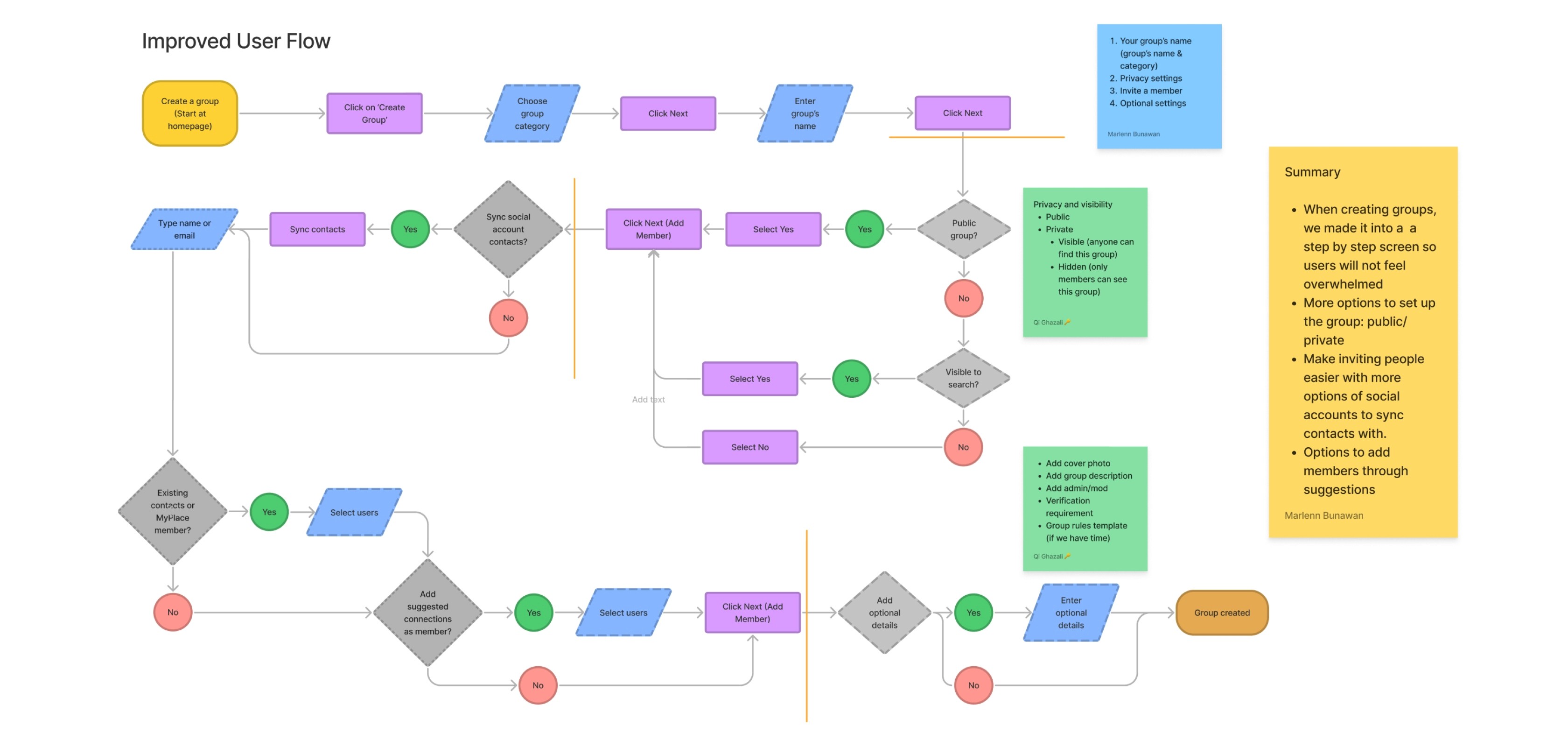
User Flows
Following ideation, we created user flow of the existing experience and improved it based on the ideas that fit with business and user goals. We ended up combining both flows of creating a group and inviting members.

Rapid Prototyping
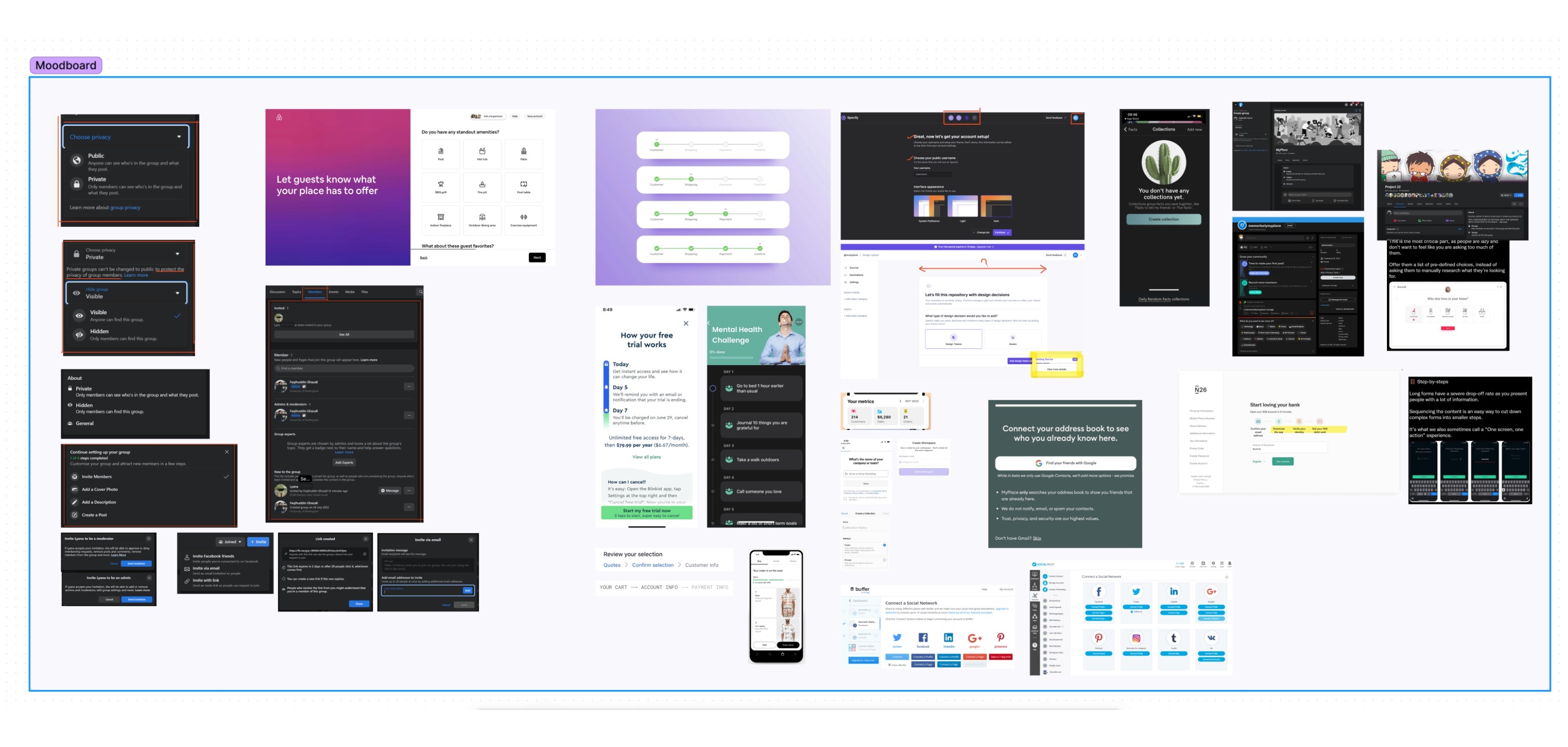
Having mapped an improved user flow, I spent time rapidly prototyping a solution. Sketching helped me rapidly iterate on the original idea and visualize a solution without committing too early to hi-fidelity screens.

I also referred to the mood board below that we built during this whole process, which made the wireframing quick and easy.
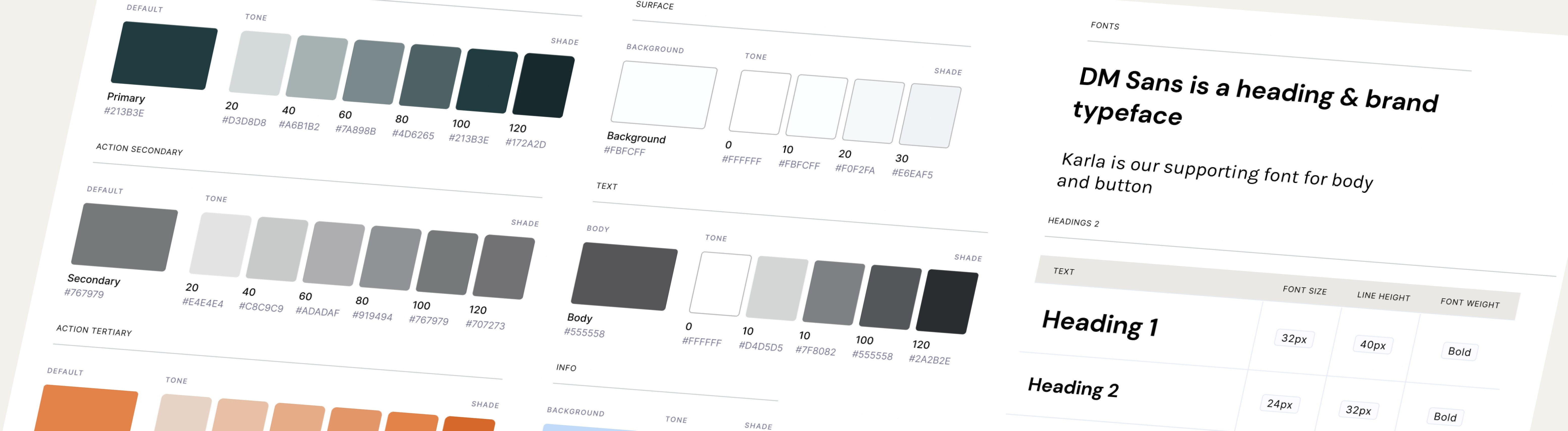
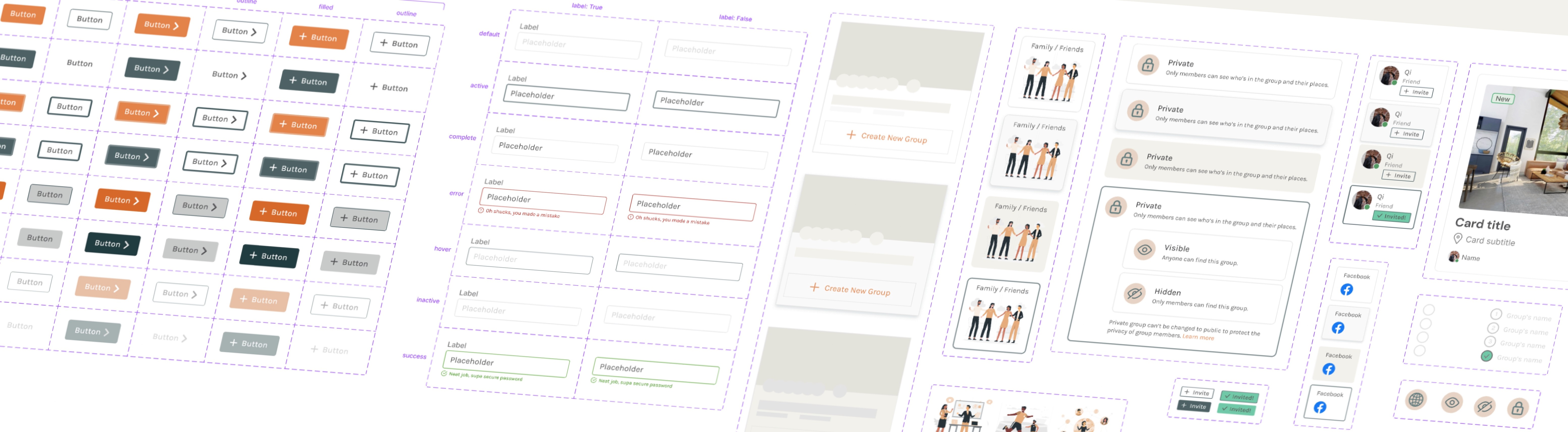
Styles & Components
Before creating the hi-fidelity prototype, we defined the product styles and interactive components in Figma to easily and quickly help us design consistently.
Some of the decisions made at this stage were
The use of DM Sans matches friendly and inviting vibes, compared to the current Inter typeface that looks stiff.
Use of rounded corners to complement the friendly mood.

Key Learnings
As we were limited to 4 weeks duration, we couldn’t perform usability testings. Nonetheless, we learnt the following:
1. Working with time constraints can be challenging, some features were ended up not implemented such as verification level requirements. This prompted us to rethink on time management for each part of the process.
2. The start (home page) and end (group page) views were not focused much compared to the group creation process. Thus, might not provide a holistic easy and secure group experience.
Next steps
If we had more time to iterate, we would take the next steps:
1. Conduct usability testing to identify improvement areas.
2. Provide a holistic easy and secure group experience by improving:
• the group section on the home page: create 'discover available groups' feature.
• the group page itself: create 'place filters' feature.