Role
User Research
Product Strategy
UI Design
Interaction Design
Usability Testing
Tools
Figjam
Notion
Maze
Figma
Timeline
5 weeks
(June - July '22)
The Problem
Millions of users used the Wim Hof Method app but it was facing an issue of low premium user conversion rate. Their main feature, 20 days cold shower challenge wasn't emphasized as the main CTA and had problematic user flow. This confused the users, which they ended up giving up early and not committed to forming a healthy habit, resulting in low premium conversion rate.
The Solution
To improve the premium conversion, we focused on ensuring smooth user experience throughout the cold shower challenge by making the challenge CTA more prominent, having friendly copywriting, and a new journal feature. Users felt the improved product was more easy-to-use and engaging.

The Users
The main users for this 20 days cold shower challenge feature are those who are new to cold therapy, they want to embark on a healthier lifestyle by implementing this method.
They are generally from a demographic that uses heated water by default such as countries with four seasons / cold climates.
Usability Review
To help us better understand the current product, we conducted a usability review to identify pain points and wow moments in the existing experience. I also conducted one of the UX guerilla tactics which was analyzing the app reviews through multiple platforms.
Among pain points identified across the app are:
1. Too many CTAs making users confused throughout the user flow.
2. Not enough whitespace.
3. Bad copywriting such as negative connotations, excessive block letters use, and wordy paragraphs.
On the positive side, the app has a good choice of icons and colour.

Business & User frustrations
Following a usability review, we defined the primary and secondary business and user frustrations:
Primary Frustration
In the journey of starting the 20-days cold challenge, user gets confused on multiple screens due to unclear difficulty levels and confusing shower settings. This leads to users not being able to complete even a day challenge, resulting in poor conversion to premium paid plan.
Secondary Frustration
User feels not compelled/motivated to journal their progress because the shower completion screen is not engaging. Specifically, the lack of personalization when tracking their results.
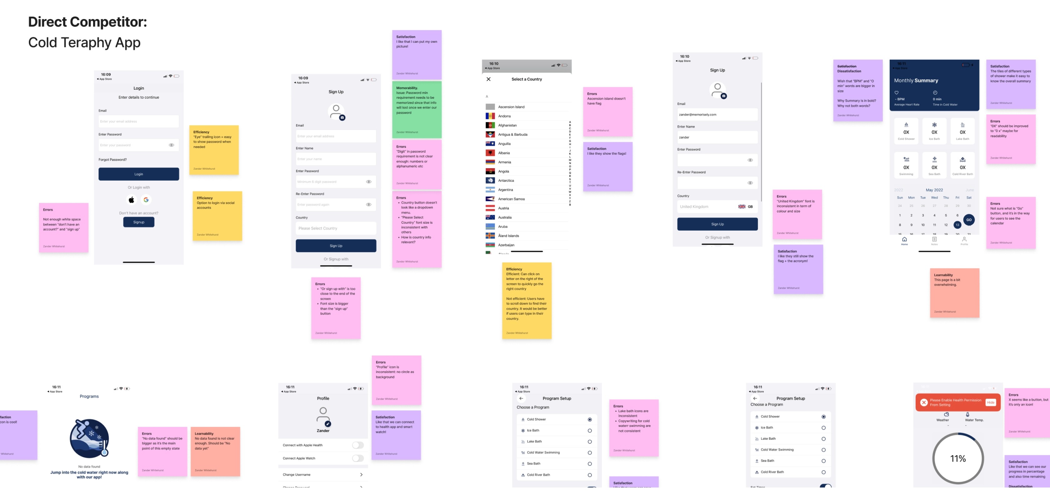
Competitor Benchmarking
With a usability review complete, we moved on to competitor benchmarking to help us identify standards in direct/indirect competitor products that could be used to improve the existing experience.
Some of the notable features were
1. Clear progress dashboard.
2. Easy timer and alarm customization.
3. Free trial of premium features.
Problem Space
Combining our initial usability review and competitor benchmarking helped us identify the problem space to begin ideation.
↪️ Who is affected by the problem?
New user.
↪️ What is the problem?
User can’t complete even a day challenge without frustration.
↪️ Where does this problem occur?
From the initial screen of the main exercise screen throughout the challenge screen.
↪️ When does the problem occur?
When the user first wants to use the app and start the challenge.
↪️ Why does the problem occur? Why is the problem important?
The app is confusing and overwhelming. The problem is important because we can’t convert free user to the premium plan.
With a picture of the problem at hand starting to come into place, we formed a 'How Might We' statement to begin forming a solution.
How might we make it easier for new users to complete their first day shower challenge?
Ideation
To avoid following the first idea, we conducted a series of ideation techniques. This allowed us to consider an array of solutions. Following ideation, we mapped what could be improved or added to the product using 'effort vs impact' matrix.

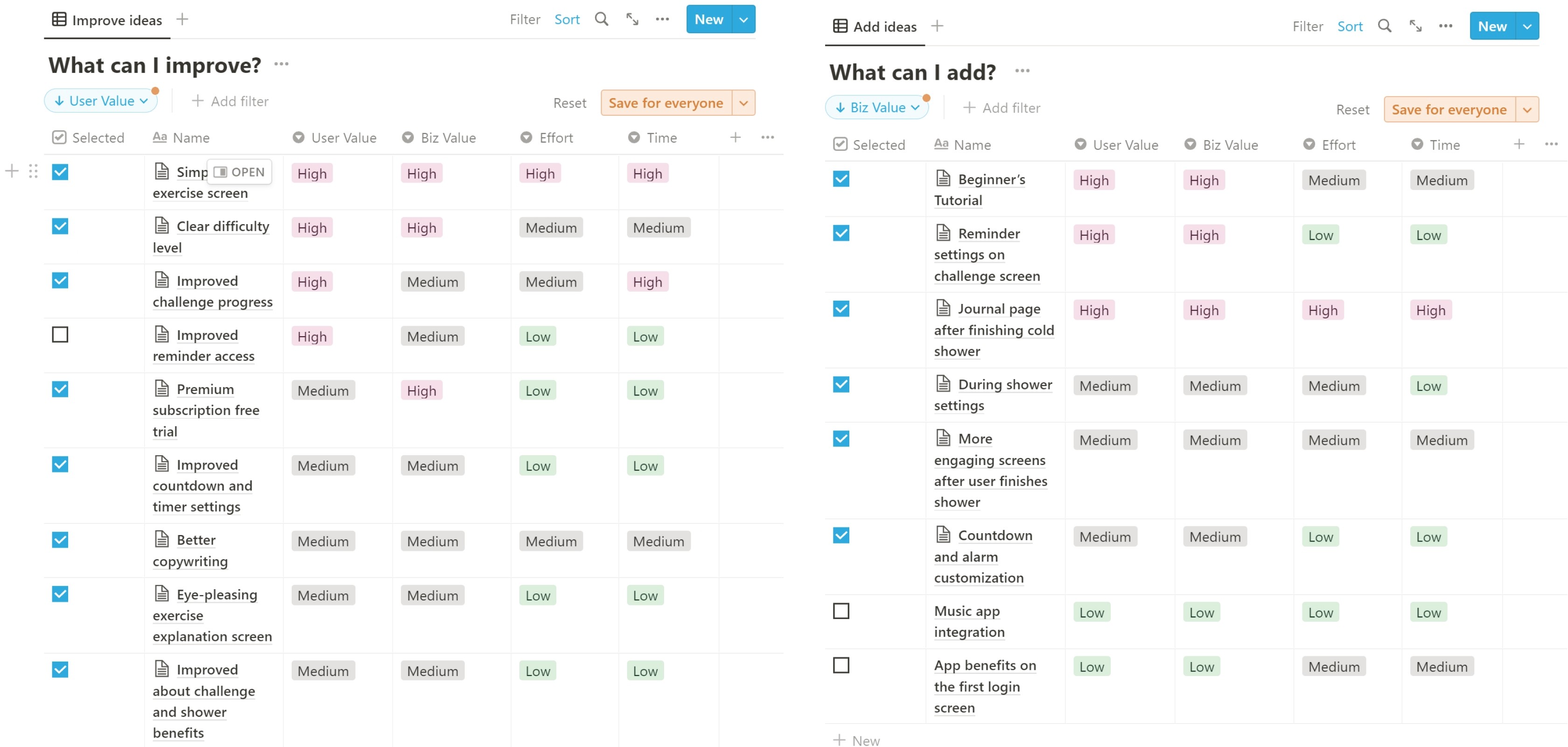
What can we add
1. Beginner’s tutorial
2. Journal page post challenge
3. Customizable shower settings
What can we improve
1. Simpler main exercise screen
2. Clear challenge progress tracking
3. Easier difficulty comparison
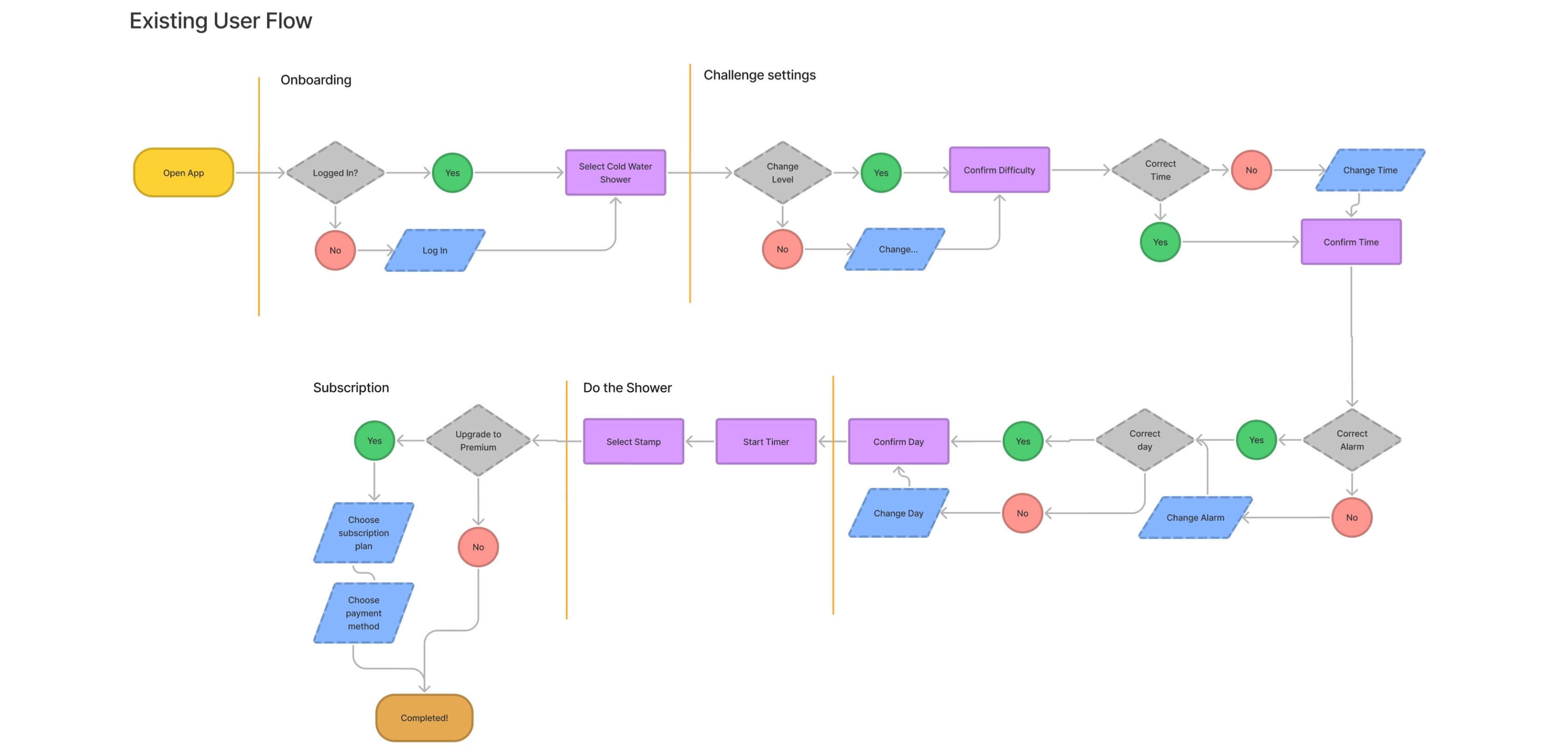
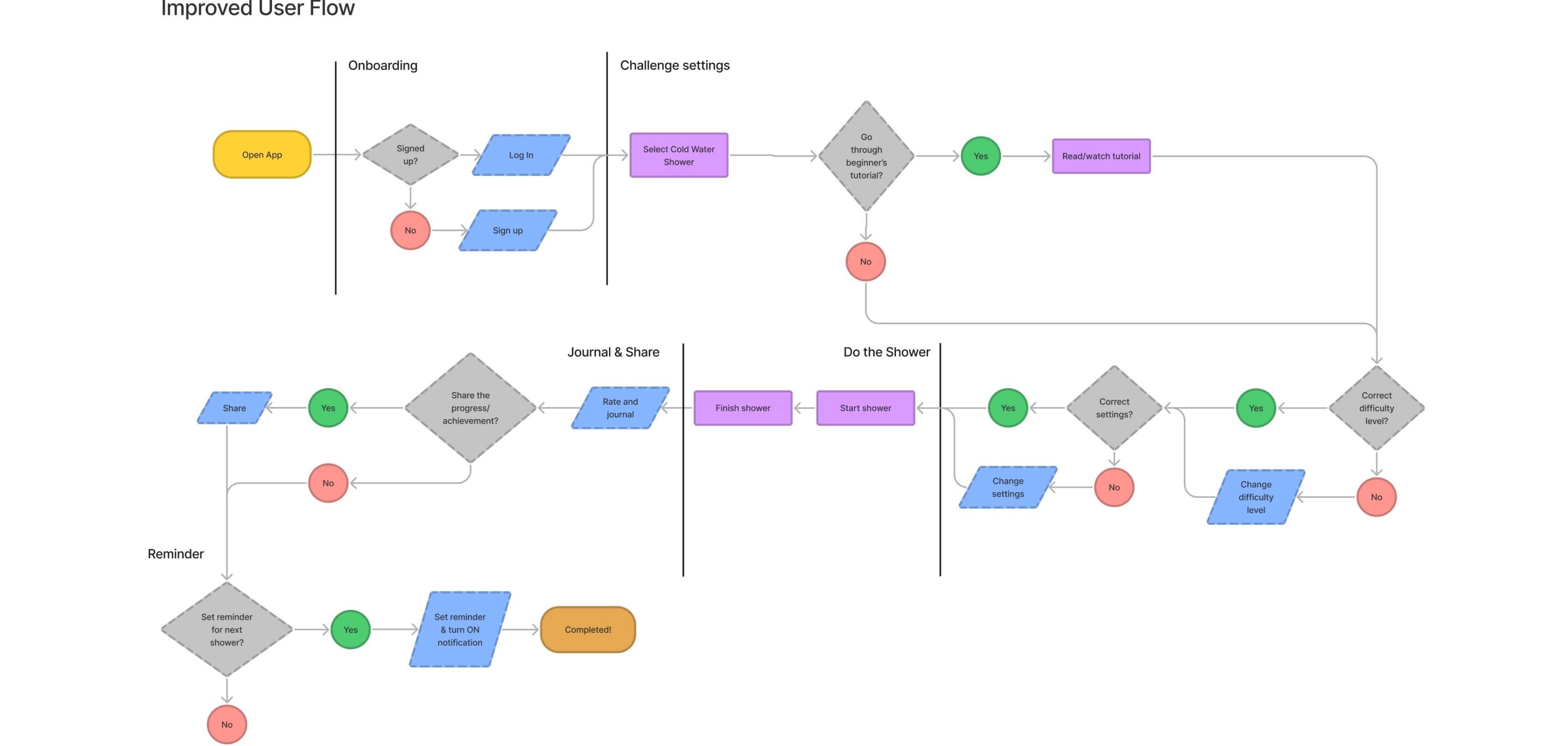
User Flows
Following ideation, we created user flows of the existing experience and improved the flow based on the idea that fit with business and user goals.
One of the newly added parts was challenge reminder nudge. This was to encourage users to do the challenge daily, forming a healthy habit. Another was beginner's tutorial considering that many users might be new to the cold shower challenge.
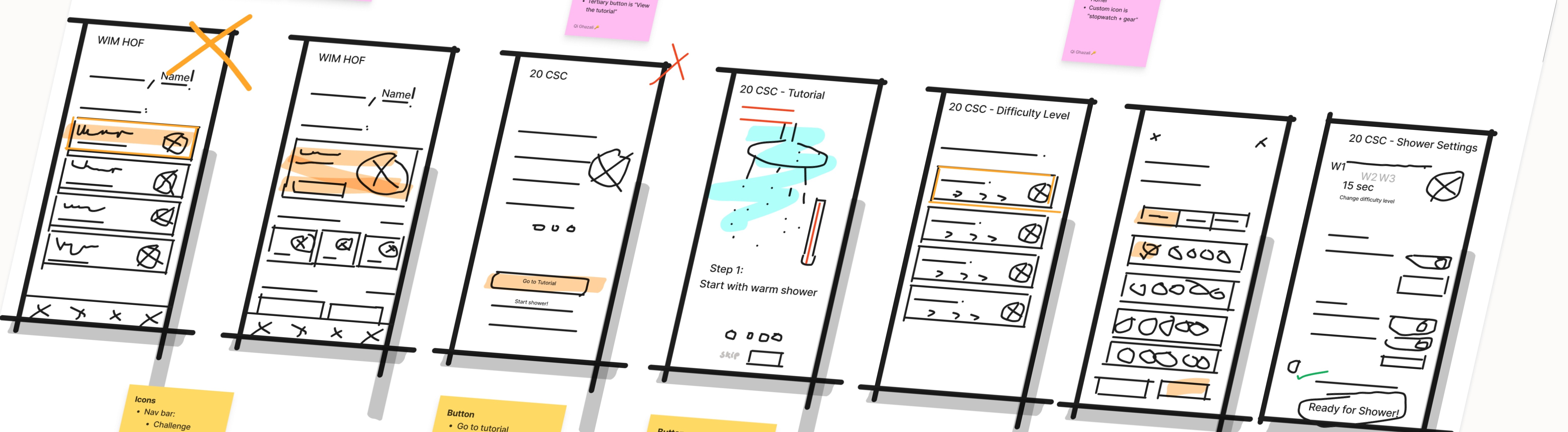
Rapid Prototyping
Before jumping in with hi-fidelity work we spent time rapidly prototyping the experience in lo-fidelity.
During the later stage, I learned that translating lo-fi wireframes to mid-fi and hi-fi prototypes might not be 100% the same, and required iteration again. Some of the original ideas that didn't make through the final versions were shower head figure and raindrop animation.
Styles & Components
Before creating the hi-fidelity prototype, we defined the product styles and interactive components in Figma to easily and quickly help me design consistently.
Some of the decisions made at this stage were
1. The use of orange colour to invoke positive vibes, in line with the goals to encourage the users to form new healthy habits.
2. The app icon inspired the use of honeycomb patterns, creating a consistent motive throughout the app.
We also went back and forth on the components, doing iterations when doing the hi-fi prototype.


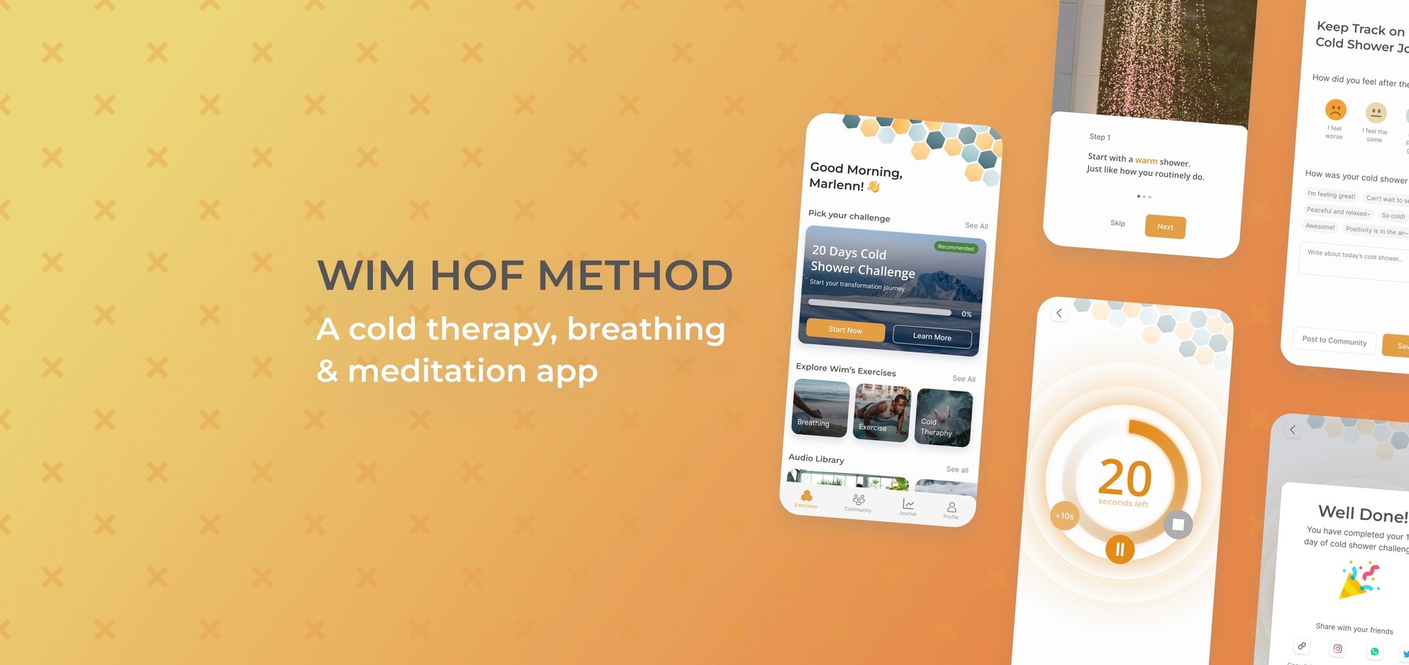
High Fidelity Prototype
Below is the final version of the prototype that we created, which mainly was built by me with many ideas contributed by my teammate. I included transitions on Figma to match the flow of the product. A few micro-interactions were also added to provide feedback to the users.
Some of the notable features are:
1. Circular timer animation indicating 1 sec for each complete loop.
2. Emoji selection for users to journal their experience post-shower.
3. Reminder nudge animation to encourage the users.

Watch the video below for the prototype walkthrough.
You can also give it a try here.
Usability Testing
With the prototype created we formed a testing script with scenarios and tasks for the user to complete to validate the prototype with real users. To test the prototype, we used Maze and gathered feedback following every task.
Test outcomes
The results from the unmoderated test were mixed and filled with learnings. Some of the results:
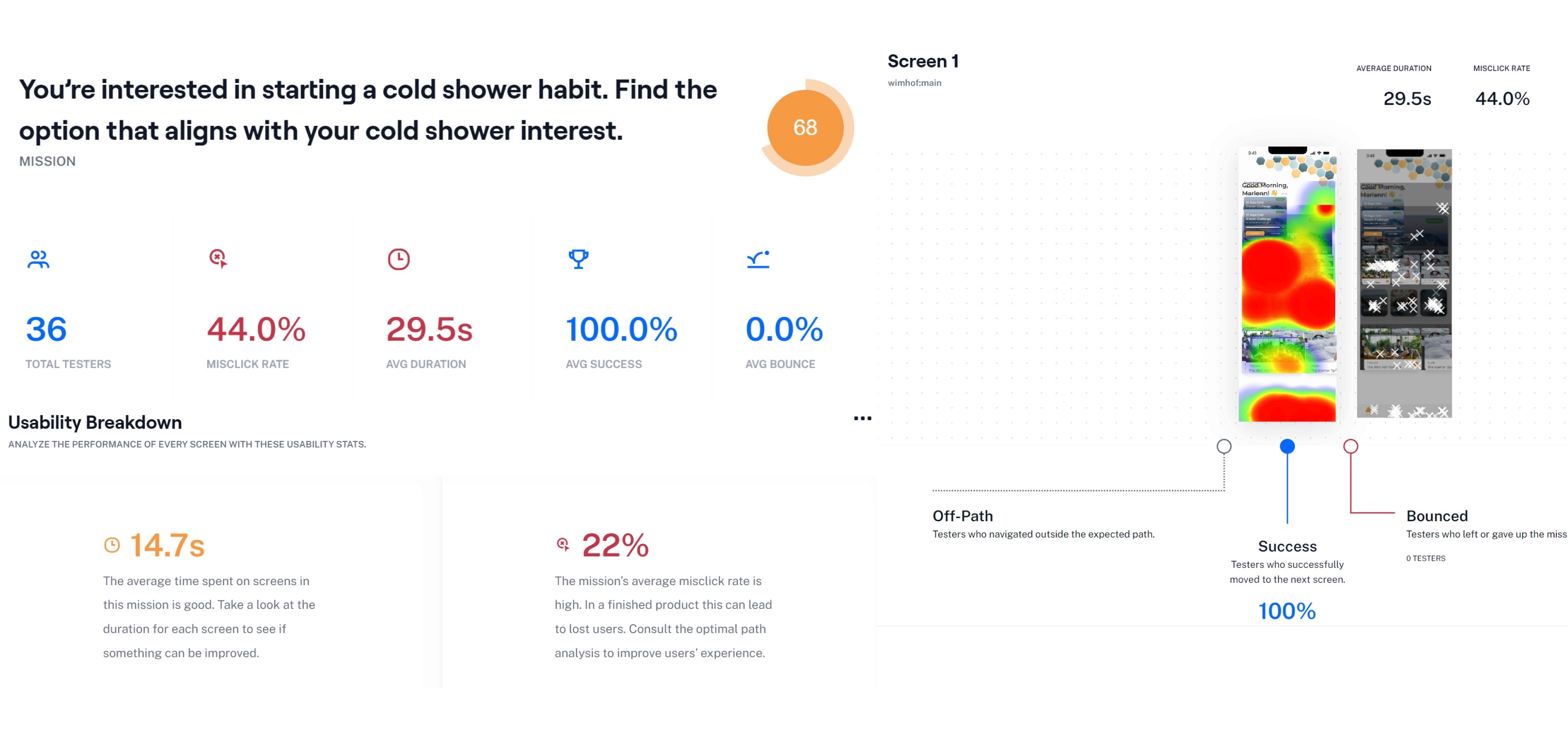
Mission #1: Go to the challenge screen
69% score | 43% misclick rate | 100% average success | 0% average bounce
Mission #2: Go to the shower settings
17% score | 82% misclick rate | 46% average success | 18% average bounce
Mission #3: Journalling user's feelings post-shower
46% score* | 100% misclick rate* | 100% average success | 0% average bounce
Note: Results are not representative because user’s expression inputs should have been counted as success.
Key learnings
1. Fulfilling User’s Satisfaction & Business Need
20 out of 22 users were satisfied with the Journal screen post activity as it encouraged the users to easily express what they feel, making each experience to be meaningful. Users were motivated to journal their progress which solves our business secondary frustration.
2. What designers think can be different from what users think.
As tested from 2 separate missions, users tend to perceive gear icon ⚙️ on “custom difficulty level” as “shower settings or premium paywall” which resulted in misclick rate as high as 82%.
Next steps
If we had more time to iterate, we would take the next steps which were mostly discovered from the testing:
1. Improve the shower challenge CTA click rate by making the other options on the home screen less prominent.
2. Remove the gear icon ⚙️ on “custom difficulty level” to not confuse the users with the "shower settings".
3. Change challenge completion percentage to day count instead.
Example: 5/20 days instead of 20%. This is more clear to the users because they see absolute figure instead of trying to make sense of what the percentage actually means.